Emporia Energy Community › Support Center › Emporia App › Graph scrolling in the app
- This topic has 9 replies, 9 voices, and was last updated 7 months, 1 week ago by
EnergyNerd iThree.
-
AuthorPosts
-
-
gthomas785
MemberI used to be able to scroll the graphs seamlessly to view my usage at specific points in time. Since the latest app update it just jerks around in discrete “chunks” when I try to scroll. It’s very hard on the eyes and difficult to compare minute by minute consumption. Is there any way to restore the old behavior? Thanks.
-
hossboss
Member+1, agreed.
Emporia, thanks for continuing to develop the app! However, this latest update makes it less useful for analyzing trends. The old graph interface–where the “sec, min, hour” defined the interval, rather than the window, was more intuitive. And the discrete “chunks” mentioned above make it really hard to analyze usage over specific periods. It’s very limiting when I can only see usage for 8:00-9:00am; what if I wanted to see 8:30-9:30am?
Please please revert to the old graphs. Thanks again.
-
Kevin @ Emporia
Emporia StaffThanks for the feedback @gthomas785 and @hossboss – we’ve sent that over to the team to review. Don’t think we’ll have an option available soon to “rollback” to the previous functionality, but certainly looking to make more improvements re: graphing.
-
flyoffacliff
MemberI’m also disappointed by this change. I’m downgrading to the previous version of the app for now. Hopefully it doesn’t break soon.
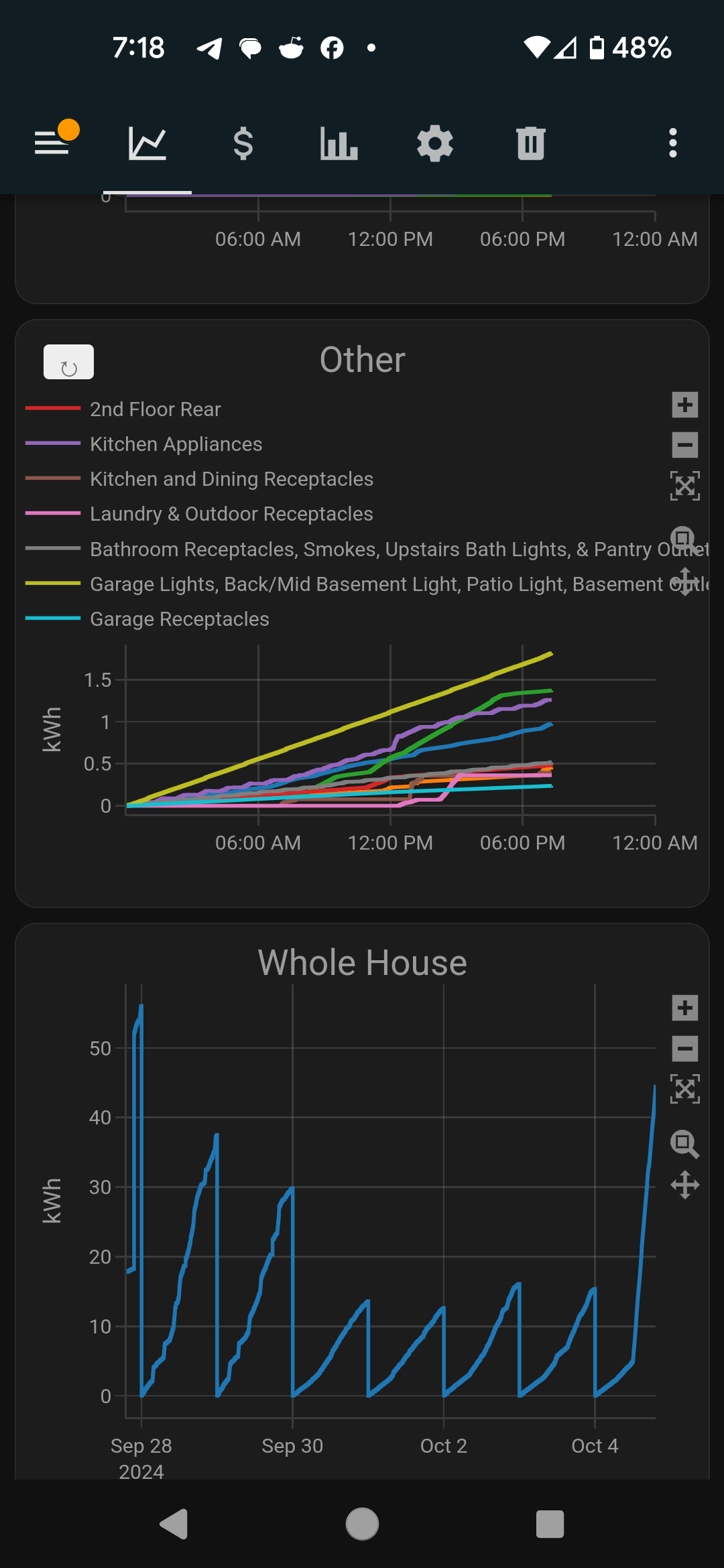
Perhaps you could pass this off to your Dev team for some inspiration. These are custom graphs I developed using your API. I think it provides a better representation of all the circuits together, showing how they change throughout the day and reset at midnight. I can drag to adjust the time range and tap each circuit to add or remove from the graph. The graphing library is called Plotly.
-
Emporia Support
Emporia Staff@flyoffacliff, thanks for the feedback and the example; I have sent this to the dev team.
-
Westdonkeyk
MemberAgreed, it’s the oddest implementation of a graph I have ever seen, especially considering the previous graph was fine. Who asked for this?
Interestingly, the developers added a left and right swiping/page feature to the graph, when this should have really been added to the Home (list of circuits) page. Tapping through arrows to go from hour to hour (while hiding the balance row in the process) is tedious. Let me swipe and page through this area!
-
Wei-Hsiu
MemberI rely on your app to monitor my power consumption throughout the entire day. However, the current 20-minute timeout on the Mobile App and Web App requires me to refresh frequently, which is quite inconvenient.
Could you please consider removing or extending the timeout period? This change would greatly enhance the usability of the app for continuous monitoring purposes.
Thank you for your attention to this matter.
-
JesseStLaurent
MemberPlease bring back the scrolling graphs! While the new version of the app looks much nicer aesthetically, this is a major step backwards in functionality. I scroll back through my circuit chart nearly every time I look at it. Paging backwards an hour at a time does not allow me to easily review trends. For example, this morning I tried to review the power consumption of my water heater because our usage pattern has changed and I want to see the impact on power. Without the ability to scroll, I am not able to see this in 1 hour windows with a fixed start/end time on the view.
Please bring back the scrolling graphs. It is a feature I use nearly every time I use the app.
Is there a way I can continue to run the old version?
Jesse
-
EnergyNerd iThree
MemberJesse,
The community might be able to grab the old “APK” file for Android users, that can then be sideloaded.
Turning off automatic updates in the app store can help protect you from new versions like this.=============================
Scrolling graphs are very very much needed.
Even better if you could scroll one way for time forward/back, and another way to flip between circuits.The user factors in the old app are poor enough, sadly the new app took such a big step backward.
-
Member
Judging by the number of spam posts “Effective Treatment for Bacterial Infections” reported but not removed,
Emporia is not monitoring the forums very closely.I suggest chatting up support for those unhappy with the new graphs.
For those with more technical background looking for really flexible graphing
head over to the open project:
https://www.reddit.com/r/IoTaWatt/-
This reply was modified 7 months, 1 week ago by
-
This reply was modified 7 months, 1 week ago by
-
-
AuthorPosts
- You must be logged in to reply to this topic.