Emporia Energy Community › Product Ideas › Option for Log scale on charts and syncing second, minute, and hour charts
- This topic has 3 replies, 2 voices, and was last updated 3 years, 4 months ago by
BrianR.
-
AuthorPosts
-
-
John Polasek
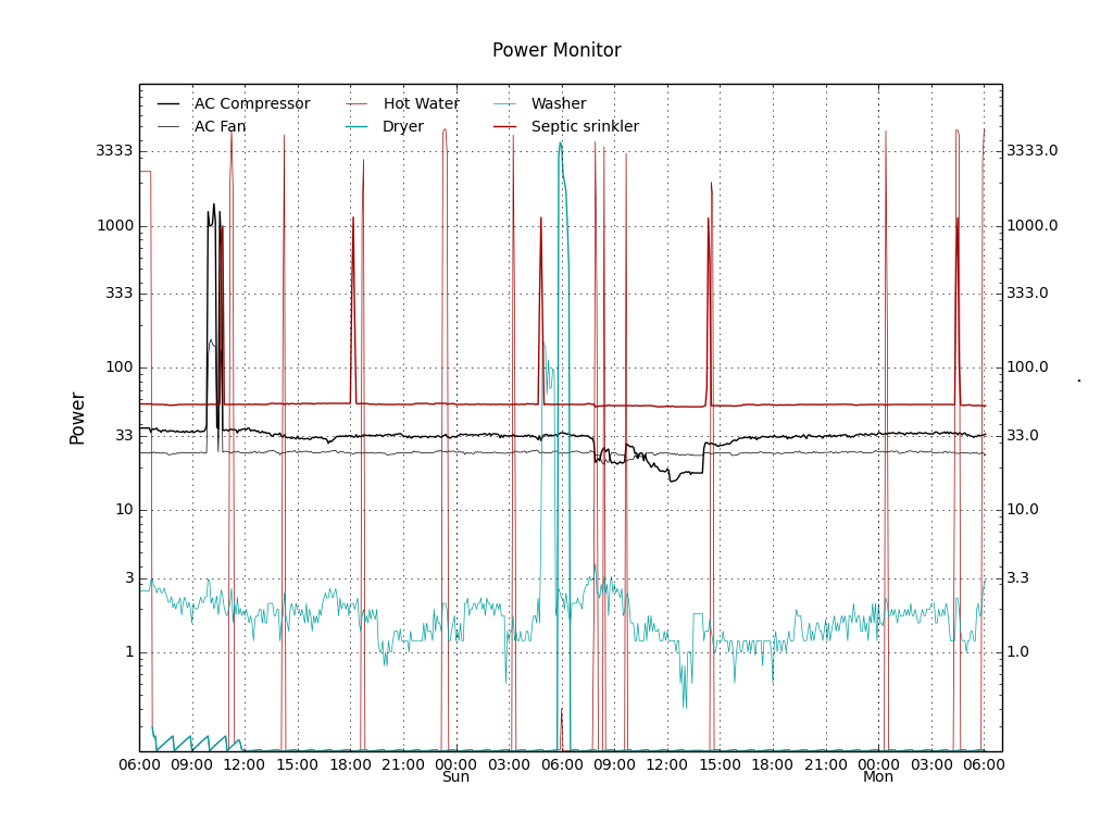
MemberIn the pseudo real time plots that I get from my Home Control software, I put the minute by minute power consumption in log scale; giving me a chart that looks like this; The washer control system runs 1 to 4 watts continuously even when off, so it looks a little jagged, but it’s easy to see when the motor engages to do a load of laundry, and I can see every time the hot water heater, Heating system, and sprinkler on the aerobic septic system triggers and for how long. This is a lot more useful than having to scroll left and right across your hour chart to see nothing for a huge period, then suddenly a spike in the hour chart, then having to go to the minute chart and because of the autoscaling, spend forever seeing 50 watts being half scale trying to find that same period of time to see if that 1 KWH hourly bar was the usual 2000 watts for 30 minutes or 6000 watts for multiple 1 minute chunks as the HVAC compressor motor with a bad capacitor keeps kicking out on thermal overload without tripping the breaker….

-
BrianR
MemberI just posted the “Stacked Graphs” request, but your request is very similar. Seeing some of the big consumers aggregated on the Main graph would be extremely helpful – I think that’s what we’re both saying?
-
John Polasek
MemberMultiple channels simultaneously is one thing, but even for single channel graphs, allowing the use of a log scale (as opposed to the way they autoscale to the highest available value) helps a great deal when you have circuits that have low constant power draw for some control circuitry coupled with a large but constant motor or heating load when running. As I scroll the minute display looking for when something turned on and off, if I miss the transition “jump”, the only indication is that the scale on the left jumps from 0 to 50 watts to 0 to 1 KW.
-
BrianR
MemberI agree with all your suggestions, the autoscale on the Y axis is not the greatest, as is lack of time zoom on X axis.
-
-
AuthorPosts
- You must be logged in to reply to this topic.
