Stacked Graphs

Viewing 2 reply threads
  • Author
    Posts
    • #8221 Report Abuse
      BrianR
      Member

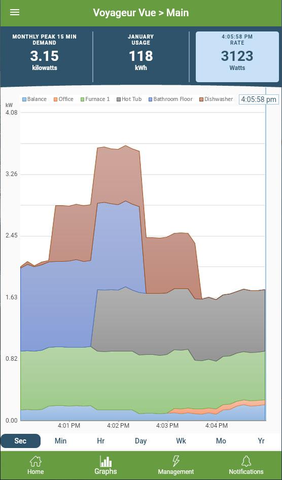
      This has been suggested in Product Ideas before, but I made a quick and dirty example (totally made up values in Excel, just for example purposes) of a stacked graph looking at “Main”.  Maybe only break out the top n circuits contributing to usage, or any circuit over 200 watts?  As I’m watching the Main graph and it spikes, I go back to “Home” and have to look at the list/numbers to decipher what may have turned on.   It would be epic to be able to click on a colored area and go right to it’s graph, but I think being able to see circuits consuming a lot would be 9 tenths of the way there…

      Is this of interest to anyone else?


      • This topic was modified 2 years, 3 months ago by BrianR.
    • #8228 Report Abuse
      Ezra
      Member

      It seems pretty clear that if they have taken no action on this front in the almost 2 years since my first post requesting it,  either not enough people have asked for it or it’s too hard for them to implement. But it would be a useful feature, so everyone else who thinks so should chime in now.

    • #8489 Report Abuse
      brm252
      Member

      I think this would be a great feature. However, with the ability to view data in Grafana with PyEmVue, many users are doing this on their own outside the native app which probably reduces the need for this. So with the cost-benefit analysis being what it is, it probably just doesn’t make sense to develop right now, unfortunately.

Viewing 2 reply threads
  • You must be logged in to reply to this topic.