Emporia Energy Community › Support Center › Emporia App › Need Help Figuring out Analysis
- This topic has 3 replies, 4 voices, and was last updated 1 month, 2 weeks ago by
Mr. Amused.
-
AuthorPosts
-
-
Idahome321
MemberThe energy cost in our home doubled over the last 5 years and in an effort to manage the spiraling cost we installed solar and consulted an electrician. He couldn’t figure out if a conduit was pulling high so we had him install a monitor on someone’s advice. We have two monitors w 16 circuit level sensors attached; one outside and one on a subpanel downstairs in our 2000 sf home in Idaho.
Honestly, I’d like to be able to tell if our fridge or freezer or furnace is going out (cycling too often) and need to be replaced or if our wiring is bad somewhere. The setup in my app with the subpanel makes it hard to do much analysis in real-time and the graphs are good looking at one circuit …. but how can I get it to zoom out and compare my whole home usage to see what is/are my energy vampire(s)?
I am a mom of young kids with a degree in accounting, I can analyze numbers — but I don’t code python or know how to install raspberry pi or do Home Assistant. So in the last 6 months, I have exported our CSV data monthly but I have no way to get that data into a form I can analyze holistically. Am I not using it right? At this point, I have to click into every circuit and hand record every monthly or weekly usage to get any comparative analysis. Do I need to hire someone to do it? Can someone do it remotely? I’ve asked in my community FB group if anyone has experience with Home Assistant or Emporia and so far I haven’t had any takers and I’m not sure I need Home Assistant. Also the Solar monitoring and data I’m getting seems like nonsense.
I’m feeling I probably would have been off with another home monitor. Should I just try to find someone local who wants these and try over with something else?
-
joacchim
MemberIf you can use Excel you can import your csv file into it. It’ll take some massaging to get it into the right columns but it can be done.
Import or export text (.txt or .csv) files – Microsoft Support: https://www.bing.com/ck/a?!&&p=17ce1abe502284f4JmltdHM9MTY3NTEyMzIwMCZpZ3VpZD0xNGU0ZjZjMS02NzA2LTYwYWItMDQ0My1mYTdlNjZkNjYxZDAmaW5zaWQ9NTQ2OQ&ptn=3&hsh=3&fclid=14e4f6c1-6706-60ab-0443-fa7e66d661d0&psq=import+csv+data+into+excel&u=a1aHR0cHM6Ly9zdXBwb3J0Lm1pY3Jvc29mdC5jb20vZW4tdXMvb2ZmaWNlL2ltcG9ydC1vci1leHBvcnQtdGV4dC10eHQtb3ItY3N2LWZpbGVzLTUyNTBhYzRjLTY2M2MtNDdjZS05MzdiLTMzOWUzOTEzOTNiYSM6fjp0ZXh0PTElMjBHbyUyMHRvJTIwRmlsZSUyMCUzRSUyME9wZW4lMjBhbmQlMjBicm93c2UsdGhlJTIwZGF0YSUyMGluJTIwYSUyMG5ldyUyMHdvcmtib29rLiUyMFNlZSUyME1vcmU&ntb=1
-
This reply was modified 1 year, 2 months ago by
joacchim. Reason: added link
-
This reply was modified 1 year, 2 months ago by
-
OrrinC
MemberDoes anyone have an Excel file that will take this data and generate a stacked graph of the usage by channel? It’s beyond my Excel programming expertise, but I’d love to find a place to start!
-
Mr. Amused
MemberI suspect if you can’t find it in the charts or summary provided in the app, or on the web site a fancy excel chart is not going to be much help.
Granted scrolling through the data is a pain in the app, but if you are monitoring the one (or more) troublesome circuits the Hour (Hr), Day, Week, Month or Year charts should show you where the big usage is. It’s simple just to start… Here is a Month’s view (just 8 days so far in March) on the summary screen. Conveniently it sorts by usage (most at the top) on the web.
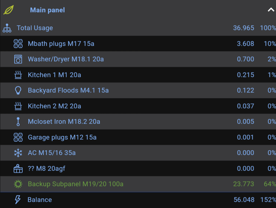
So clearly my Master Bath plugs (Mbath plugs M17 15a) chew the most electricity. Not really surprising because this circuit was tapped and powers our security system on the outside – including the string lights on our deck. My names are a bit long, but it’s a reminder that the item is in the Main panel, circuit number 17 and it’s a 15 amp breaker.Exporting the data and doing some pretty simple Excel “graph” creation just manages to show the charts by day (or by hour). Both of those are probably easier to do with the app or the web.
But there is something that MIGHT explain your unexpected energy usage… Your utility company MAY be counting the power you consume TOGETHER with the power you EXPORT to them and making you pay for both. This often happens when there is a mixup in the paperwork (or the utility company conveniently drops the ball), or when you use your solar panels BEFORE they utility company sets you up on their system correctly, and possibly if your meter is not smart enough to “spin backward”.
And it may also happen if you are in a utility that prohibits export to the grid. They charge you because you are using their grid. (And of course they sell that power to your neighbor and make a triple profit!) Or if you were required to change meters (or install a second meter) but your installer didn’t do that.
-
-
AuthorPosts
- You must be logged in to reply to this topic.