Using colors to display circuit “channels” for more data rich graphs

Emporia Energy Community Product Ideas Using colors to display circuit “channels” for more data rich graphs

Viewing 4 reply threads
  • Author
    Posts
    • #6026 Report Abuse
      Ezra
      Member

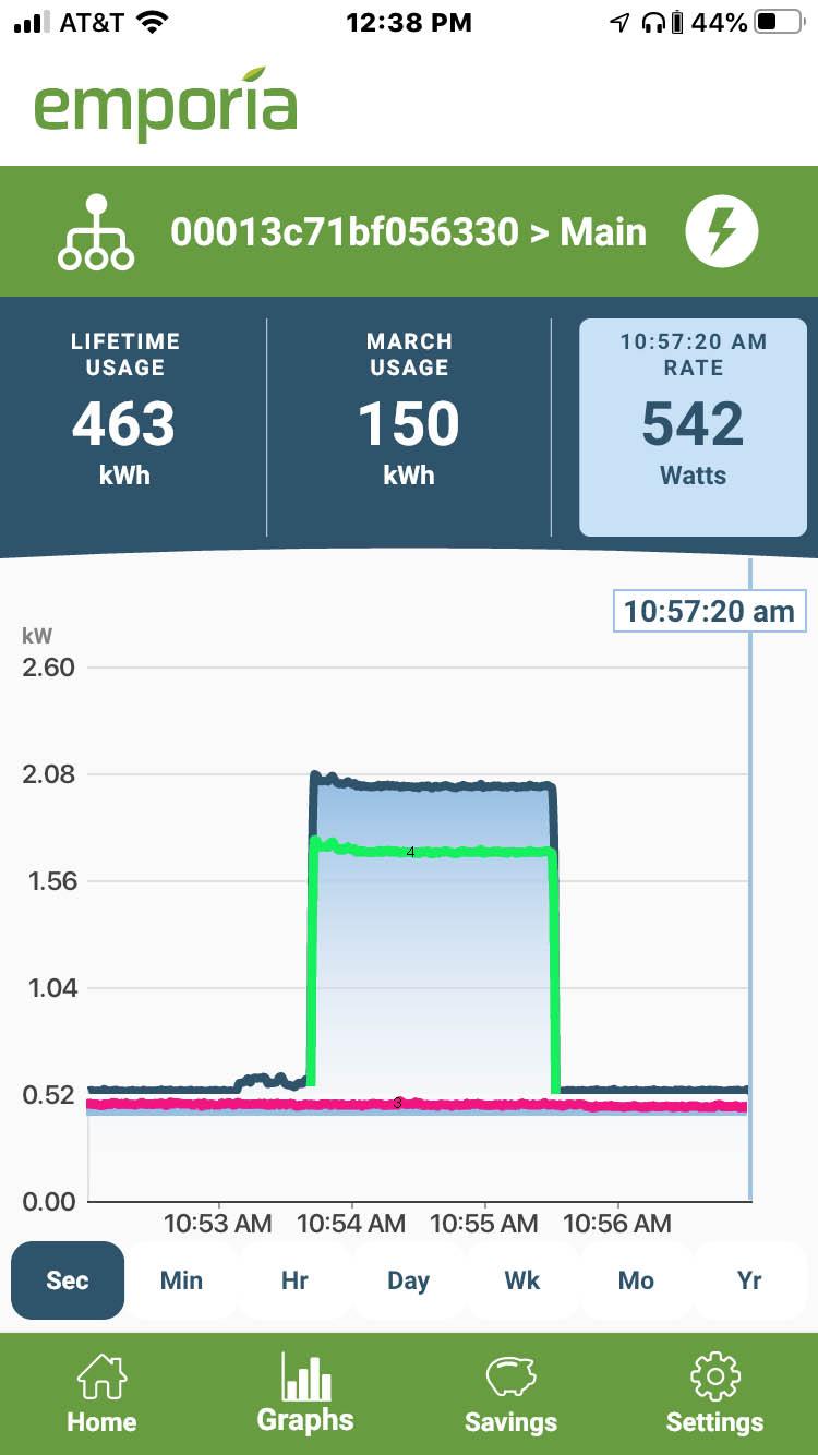
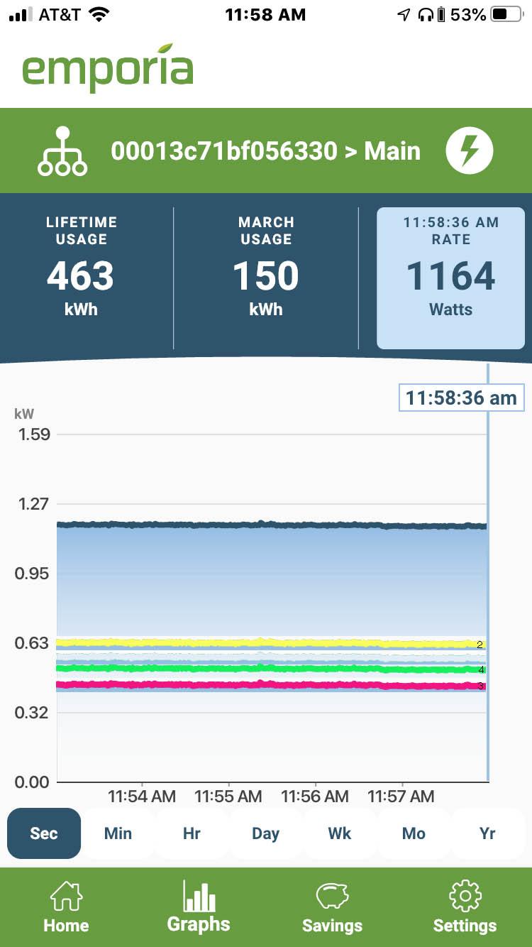
      An overall view that had each channel of the expansion module as a colored line on the main graph would be a very useful addition. It would make reading the graph and identifying the source of usage spikes easier and more intuitive. I have mocked up some examples and attached them. They are crude photoshop jobs and of course there are many good ways to accomplish the same thing, but as they say picture is worth 1000 words


      color lines 1 color lines 2

    • #7211 Report Abuse
      sir_wojak
      Member

      I agree that this would be a excellent feature.

    • #7212 Report Abuse
      Lynoise
      Member

      Yes please.

      I honestly assumed the graph would allow this (multi select when selecting the circuit).  I spent some time taping around thinking I was just missing it.

      Please please please add this, as well as pinch to zoom 🙂

    • #8225 Report Abuse
      BrianR
      Member

      Didn’t see this post, but just did the same photoshop job and requested again…

      https://community.emporiaenergy.com/topic/stacked-graphs/


    • #8230 Report Abuse
      John Polasek
      Member

      And I am currently doing the same thing in my home automation software with data exported from Emporia through the “Emporia Downloader” on Github… see https://community.emporiaenergy.com/topic/option-for-log-scale-on-charts-and-syncing-second-minute-and-hour-charts/

      Pinch to zoom would also be a huge benefit to change time scales in the graphs… my Indigo charts don’t do that.

Viewing 4 reply threads
  • You must be logged in to reply to this topic.